


LauraLynn is a hospice for children with life-limiting conditions and residential care for children and young adults with disabilities. The history of this hospice has evolved over many years from its beginnings in 1925 as a convalescence home for children from the inner city, to the opening in 2011 of LauraLynn House.
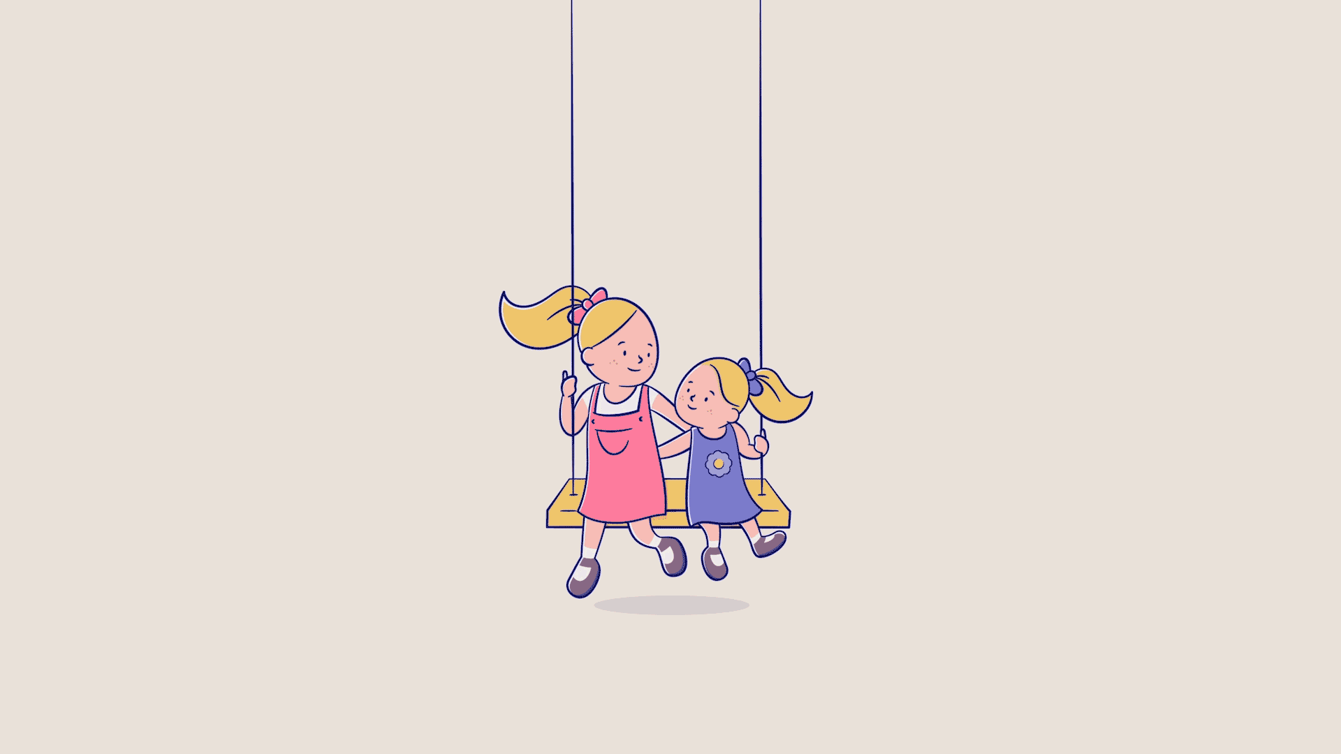
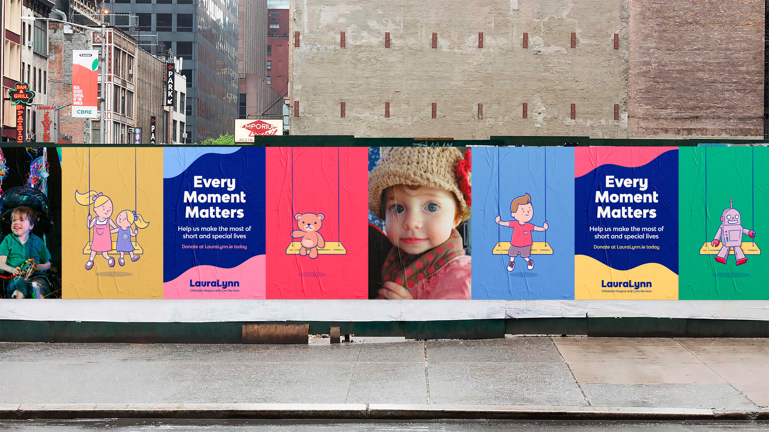
The brief was to refresh the LauraLynn brand and give it a more modern, clean and bright look and feel. The swing in our logo represents the support we give to sick children and their families, offering them a feeling of positivity and solidity. With the swing as our base, Laura and Lynn sit comfortably atop it drawn in our new signature style. Our characters can then come to life, enjoying their time on the swing.
Using the swing as our base, we can also place different characters on it, giving us a flexible dynamic way of representing different parts of what we do but always keeping Laura and Lynn as the primary logo.