


Three are a truly global brand with a foothold in markets across both Europe and Asia. That’s good for fast, reliable service and the latest technology but not so good if you want a consistent look and feel across multiple channels.
What the telecoms giant needed was a way to maintain the same visual style across all of their comms, so work made a half a world away looked like it belonged in the same room.
With a rapidly-evolving global landscape of channels for brands to communicate through, the challenge was to develop a unique and contemporary design system to help unify Three’s messaging.
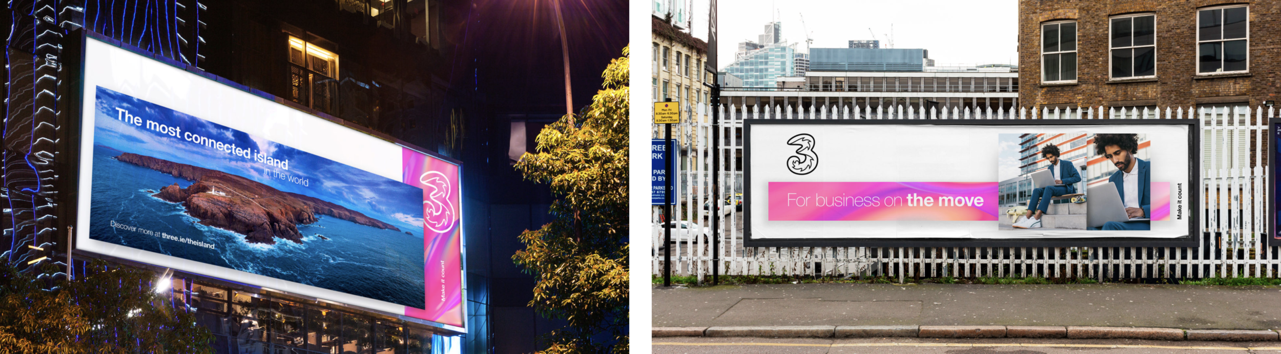
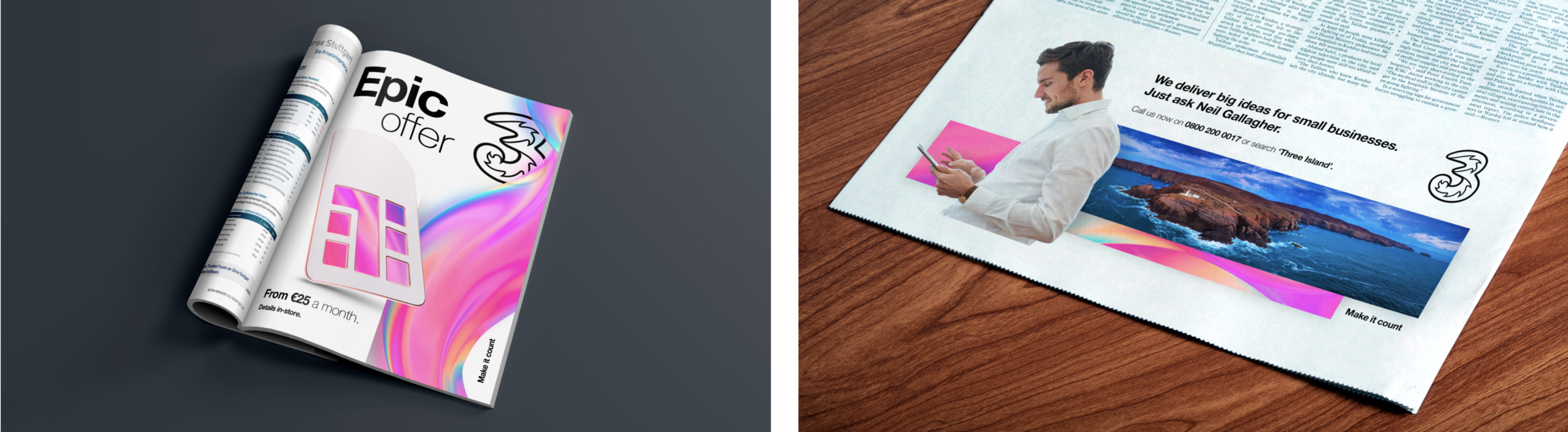
From social posts in Ireland to print ads in Hong Kong, everything needed to look like it belonged together. It also had to be flexible enough to adapt to the content, while still being unmistakably Three.
Seems straightforward enough. But it didn’t answer how to bring the brand to life in a creative and unexpected way.
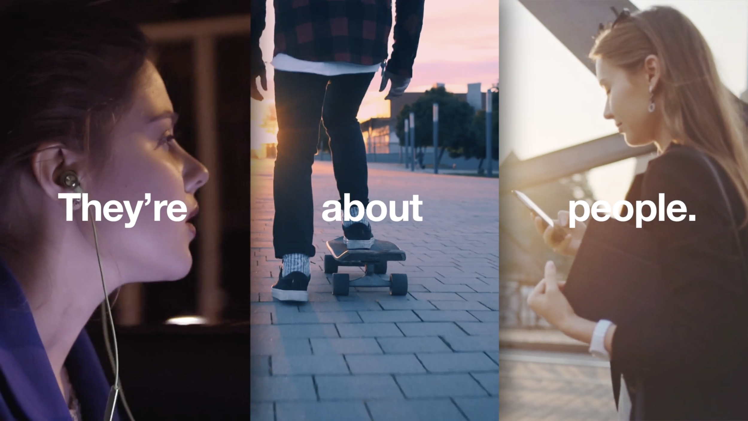
We wanted to capture the space where our real lives and our digital ones meet, to show the connections that Three make possible. It’s not quite real, not quite fantasy, but a blurring of the two we’ve called ‘Threeality’.
‘Threeality’ influences every visual element of the brand expression. You can see and feel it in everything from how images are created to how colour is used and even how brand experiences are shaped.
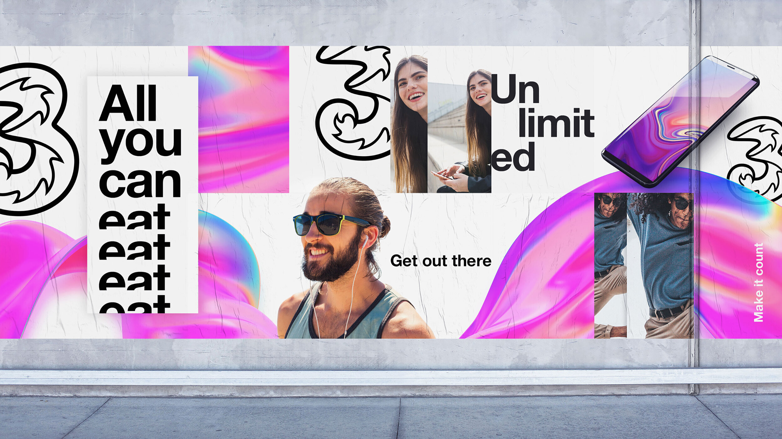
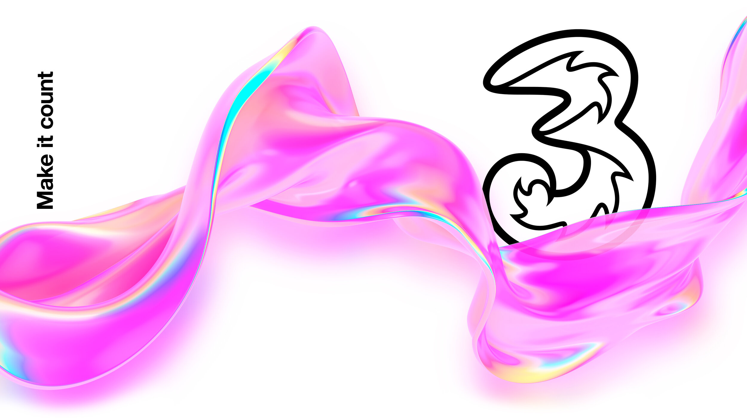
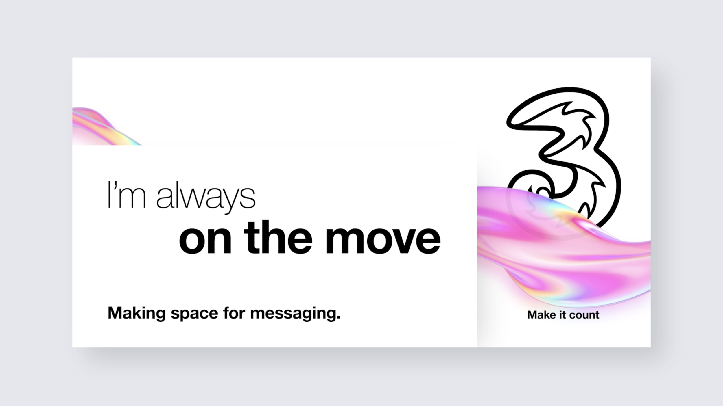
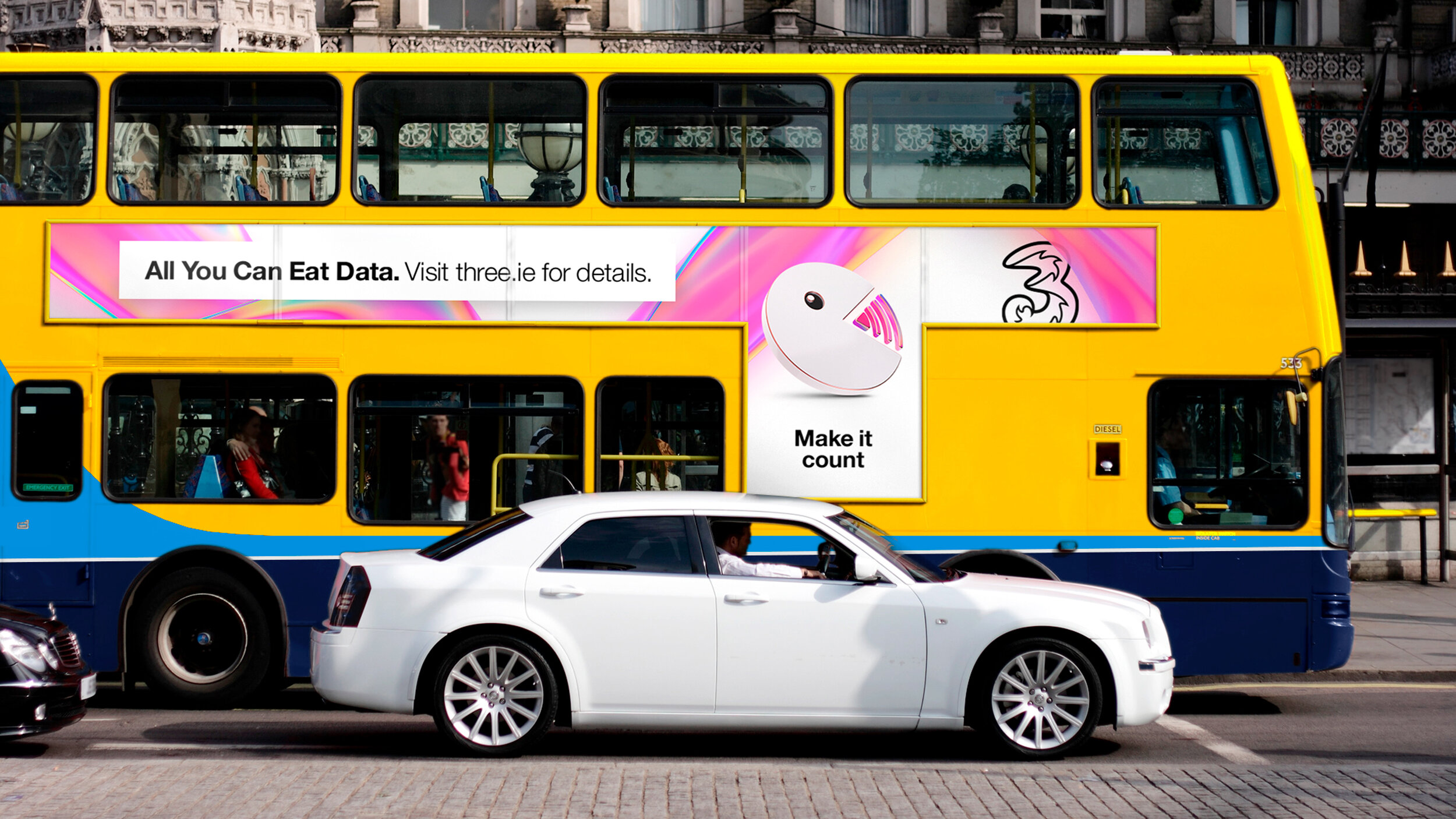
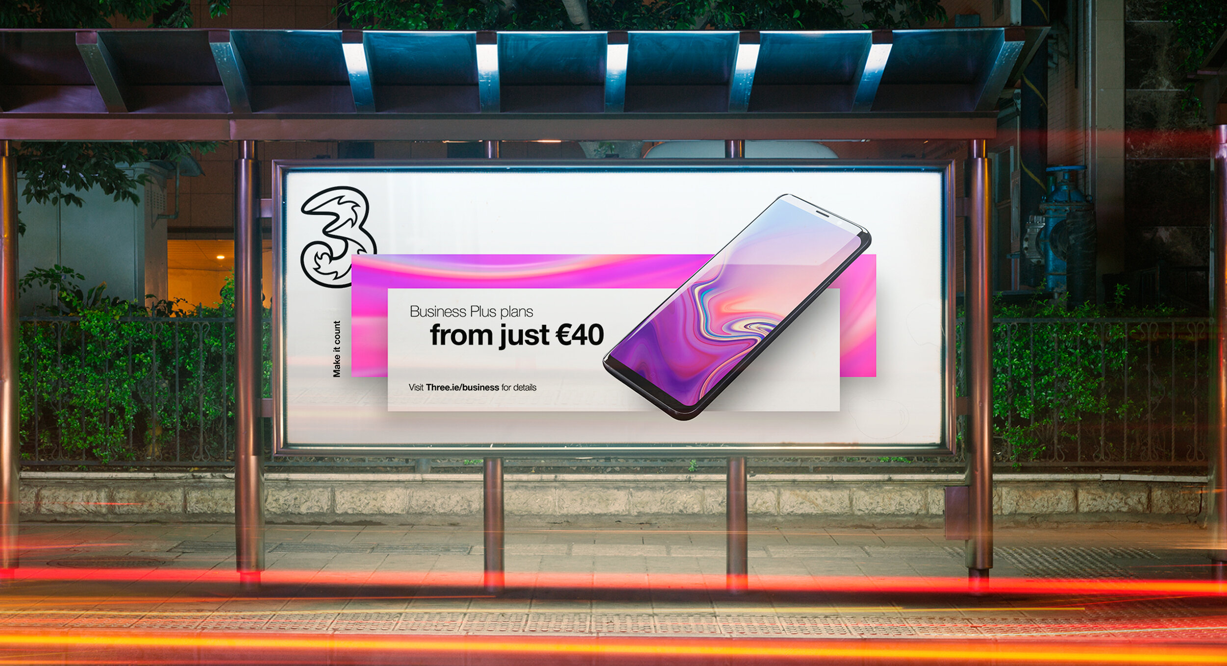
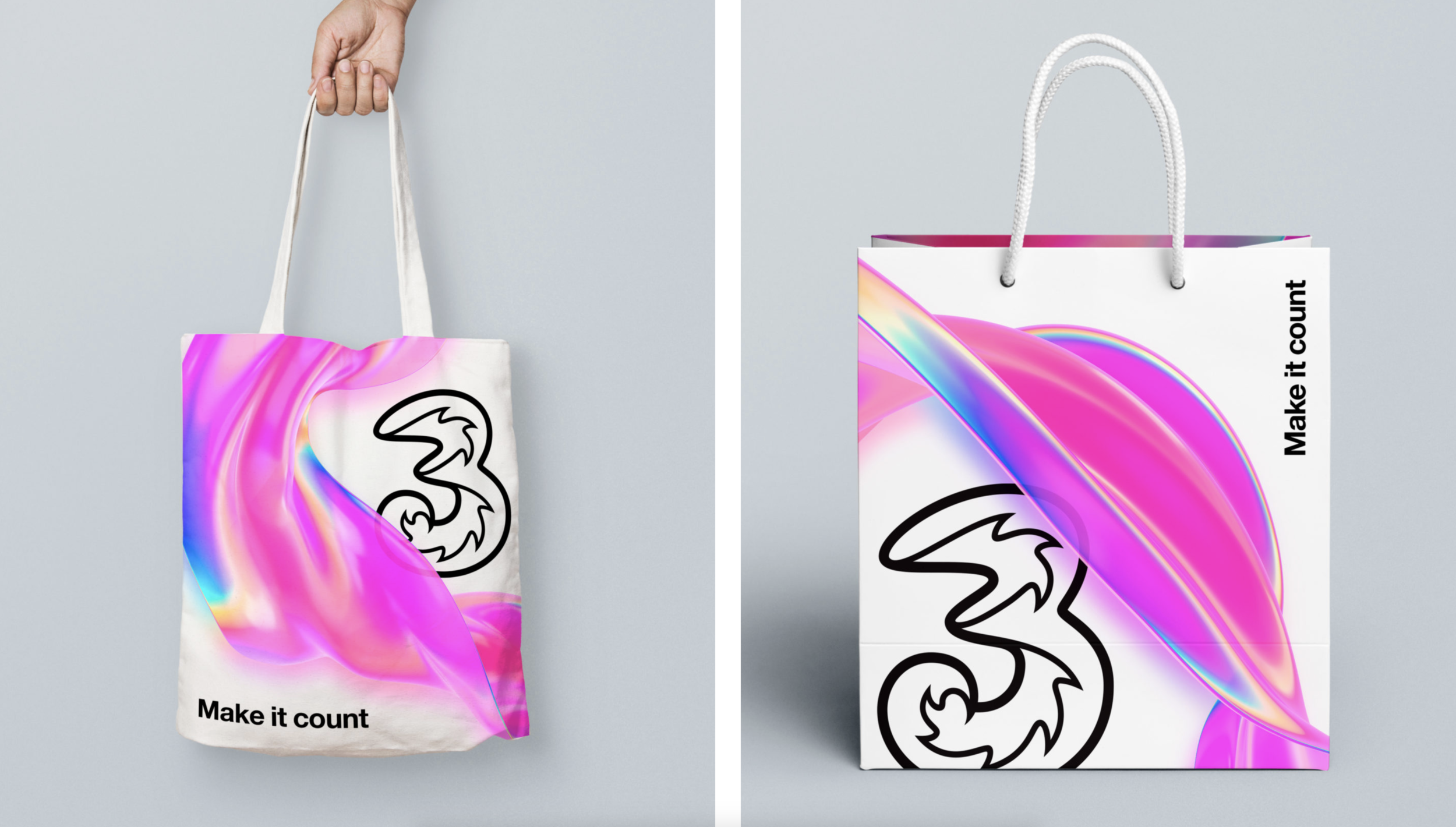
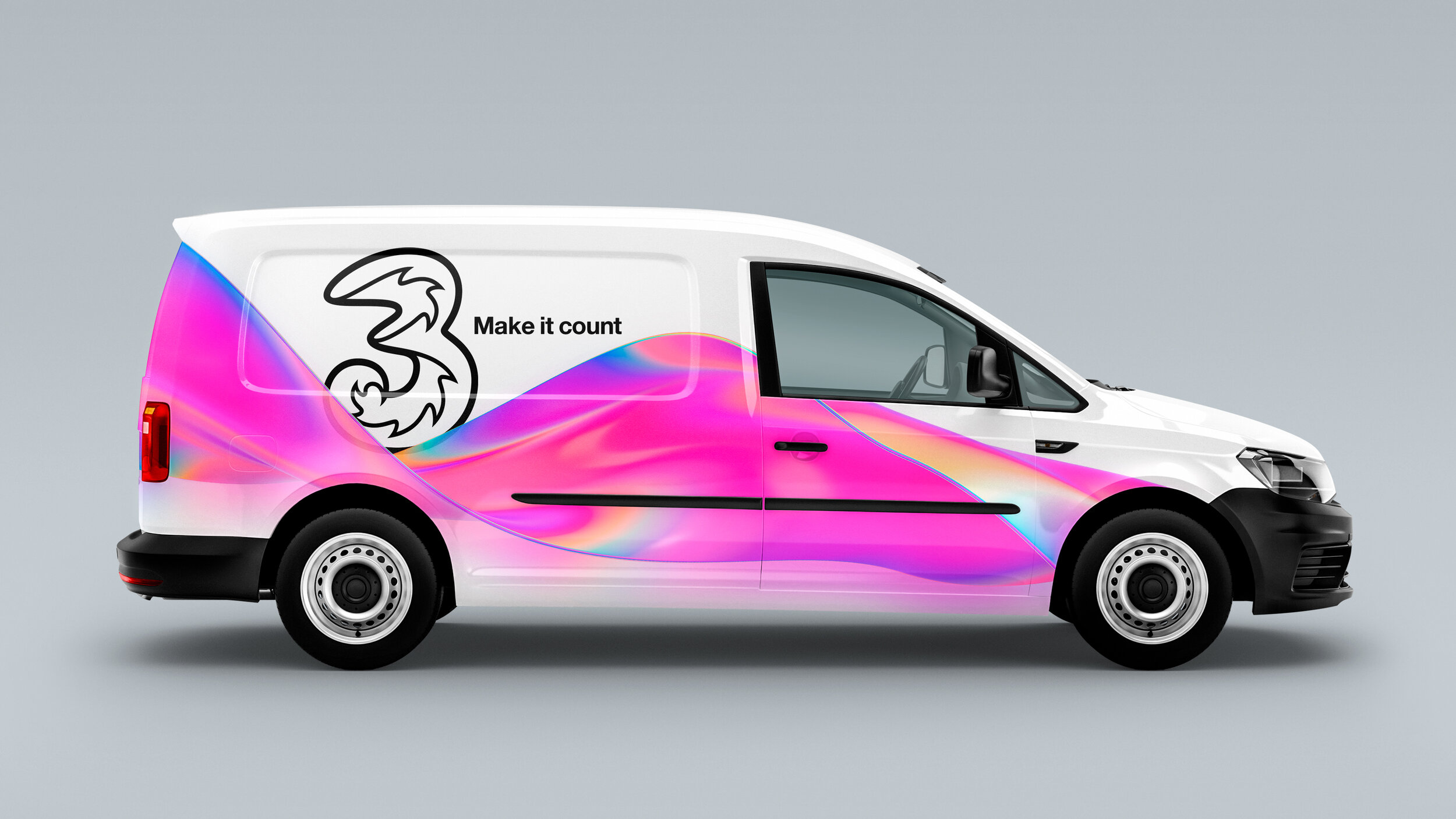
Light touches absolutely everything everywhere, making it the perfect representation of our network. Three’s core brand colours of black and white represent opposing ends of the visible spectrum of light, which gives us licence to use the entire spectrum of colour in between.
We call this ‘Living Colour’ and it is the visual manifestation of ‘Threeality’, adding emotion and vibrancy to our communications. To capture it, we created a shimmering, iridescent ribbon that’s always in motion.
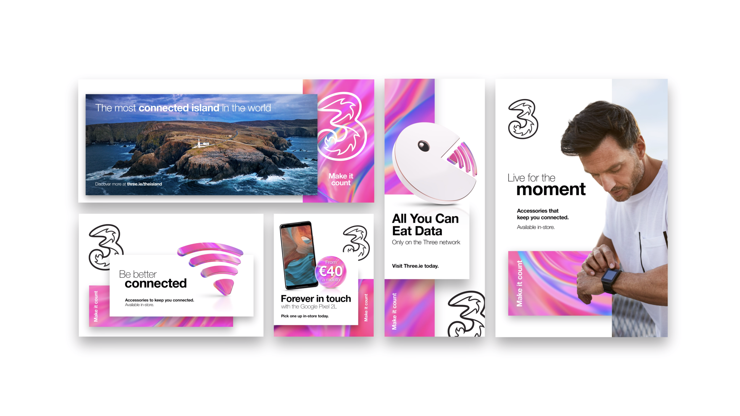
Our new visual language revolves around a simple three-step system, best imagined as layers of information, brand devices and imagery interacting with our iridescent material.
Breaking it down, brand elements, copy or imagery sit on the rear step. Our iridescent ribbon and tagline flow in to next before the third and final step is introduced to hold everything from messaging and icons to devices and images. While it may seem simple, it’s infinitely variable and distinctively clear, scaling easily to any size and translating to any platform.
Three’s new brand system is a living, breathing thing — it’s not called ‘Living Colour’ for nothing! So, it didn’t seem right to stick it up on a static page where the system couldn’t do its thing.
Instead, we built a custom brand portal where the brand guidelines could work their magic. It’s a vital resource enabling markets across the globe to really get to grips with the system and even download the assets too.