


Urban Brand Creative is a trusted, one-stop-shop for digital growth strategies. Working with start-ups, scale ups and enterprise clients, their purpose is to elevate their business by creating bespoke solutions across marketing, branding, digital, web design, and e-commerce.
Urban Brand Creative strive for the success of their clients and enable them to compete more effectively in their respective marketplace. In order to appeal to prospective clients who are looking to work with an industry leader, Urban Brand Creative needed a sophisticated and bold new identity, with clear messaging will ensure that they stands out from their competitors.
This new brand identity is based on the idea of growth and elevation. Using innovation and expertise, Urban Brand Creative takes its clients on a journey both onward and upwards.
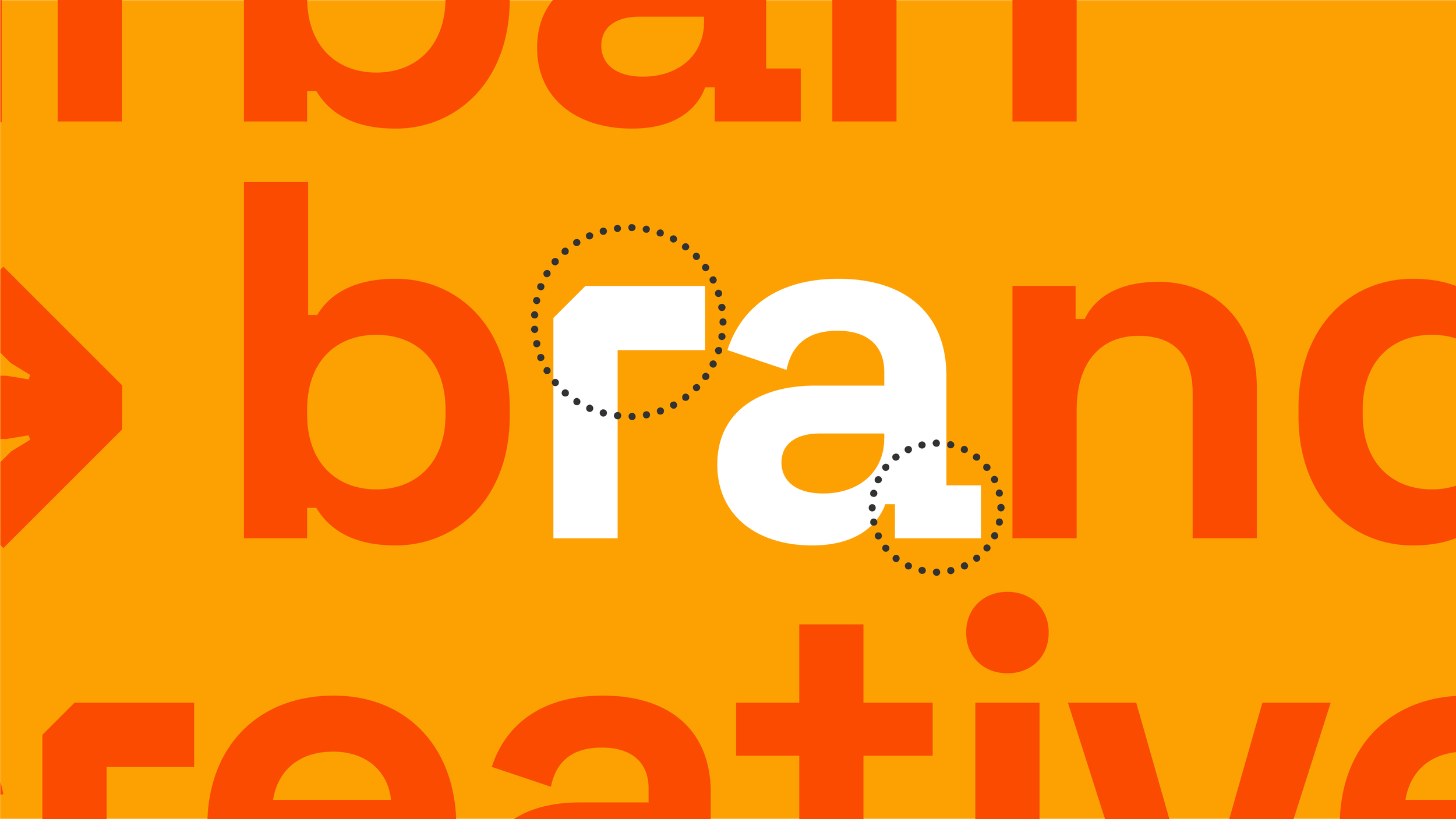
The simplest visual representation of this idea is an arrow – a symbol of forward movement that can guide you in the right direction.
The logo consists of a proportional sans-serif typeface and features the forward moving arrow glyph to symbolise growth. The customised 'r' and 'a' letters created a more bespoke and own-able wordmark.
The unique letterforms of Space Grotesk emphasises the brand’s friendly personality while its monospace-inspired shapes highlights it’s digital-first approach.
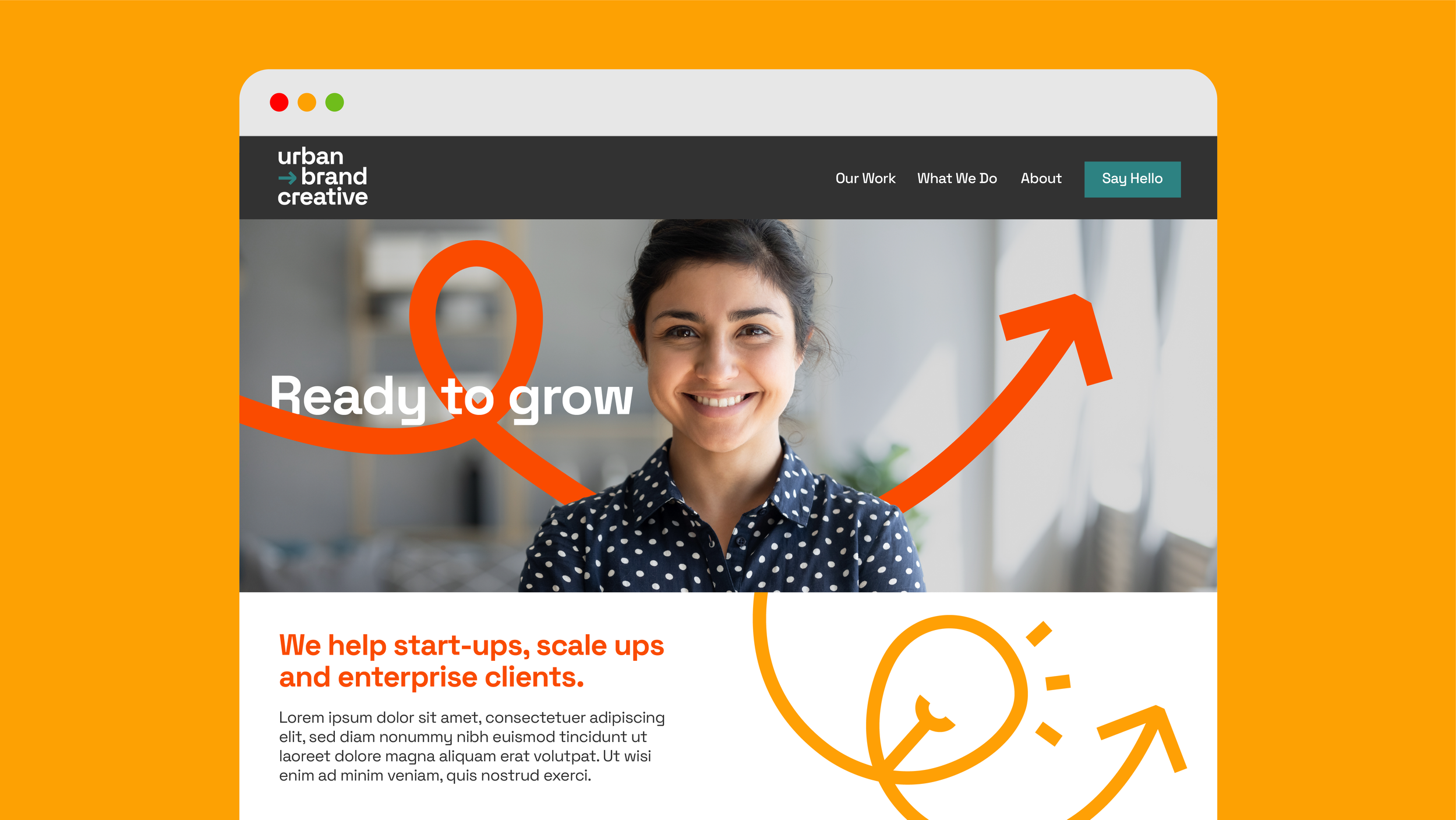
When the logo is applied to full colour backgrounds, the arrow device can wrap around and interact with the letterforms to give a sense of depth and movement to the identity. These arrow devices can also be set in motion to highlight the forward moving growth.
The main visual device is the growth arrow which loops from left to right and upwards. It can be used on a wide range of applications and can either be used as a background pattern or wrapped around typography or imagery.
The arrow device can be cropped in various ways, which allows for maximum flexibility in its application, especially on digital formats such as social posts.
The iconography style references the single loop of the arrow device which creates a set of custom icons that can be used across any print or digital format. These icons represent each of the brand’s focused areas such as SEO search, email marketing and e-commerce.
The set of illustrations expands on the iconography style by combining it with the arrow device. This allows for a wide range of imagery that can be used to hero the company's many services.